Showing posts with label contextual. Show all posts

Friday, 19 September 2014

Influences part 2- Textiles

Wool and the Gang is a cooperative knitwear company/ fashion movement. The garments are all knitted by hand, either by yourself (you buy the yarn and pattern) or by "the gang"; there is no large scale production and different designers collaborate on designs with them. I really like this approach to fashion, its very interactive and encourages people to get knitting and think about how their clothes are made.


(Giles X wool and the gang hats)

https://www.woolandthegang.com/our-story

In the Wool Shed produces hand dyed yarn from British wool, using natural dyes. Emma Price's workshop is based on the farm in Warwickshire where she runs workshops in spinning and natural dyeing. I visited her during the Warwickshire open studios and was really inspired by her work. The yarns have a lovely rich colour which changes subtly in different lights and each batch comes out a bit differently due to the unpredictable nature of the natural dyes. This process gives unique and interesting qualities that couldn't be achieved with conventional methods.

(fingerless gloves knitted in indigo dyed yarn from 'in the wool shed')

I also had a spinning workshop with her which has given me ideas for a whole other side of textiles to experiment with. I really enjoyed the experience of creating my own yarn and the possibilities of fibre and colour combinations are incredibly exciting.

(examples of my hand spinning)

http://www.inthewoolshed.com


Johan Ku. This Taiwanese designer uses a self developed yarn that glows in the dark!! I'm interested to find out more about his work, the innovative design and use of materials is really intriguing and is something I would love to explore myself.


https://www.youtube.com/watch?v=G-me652rGnU

Natsai Audrey is a designer I stumbled across whilst on the Inspirational Design blog (thanks Julie). I am particularly in awe of her "Faber Futures: The Fold" series, a collection of stunning silk scarves patterned by living bacteria. Natsai is another original thinking designer, and like her and Johan Ku I aspire to push the boudoirs with my work as to what can be achieved.


http://www.natsaiaudrey.co.uk/FABER-FUTURES-The-Fold


Shauna Richardson. I have become much more interested by large installations and community projects this summer, leaving me slightly torn as to what I want to be doing. I like the subversive nature of Richardson's work and The Lion Heart project is particularly remarkable and audacious, taking two years and 36 miles of wool to crochet. I didn't see them when they toured the country as part of the cultural olympiad but I wish I had.


On a similar note I have come across several "guerrilla" knitting installations this summer. I have no idea who they are by (I think thats the point) but I think they are quite inspiring. It would be new territory for me but I love the idea of creating something for everyone to see and using textiles to make a statement.

 ("yarn bombing" in Geneva)

(A knitted bicycle as part of Market Harborough Arts Fresco)


Influences

Rebecca Louise Law is a London based artist who works with dried flowers to create installations and compositions. I spotted a curtain of flowers in the window of her shop/ studio on Columbia road and was drawn in for a closer look. Rebecca L.L has worked on many commissions for various fashion houses and events, her larger scale installations have a spectacular impact. I admire her ambitious use of materials and I really like the idea of working with flowers and natural objects.


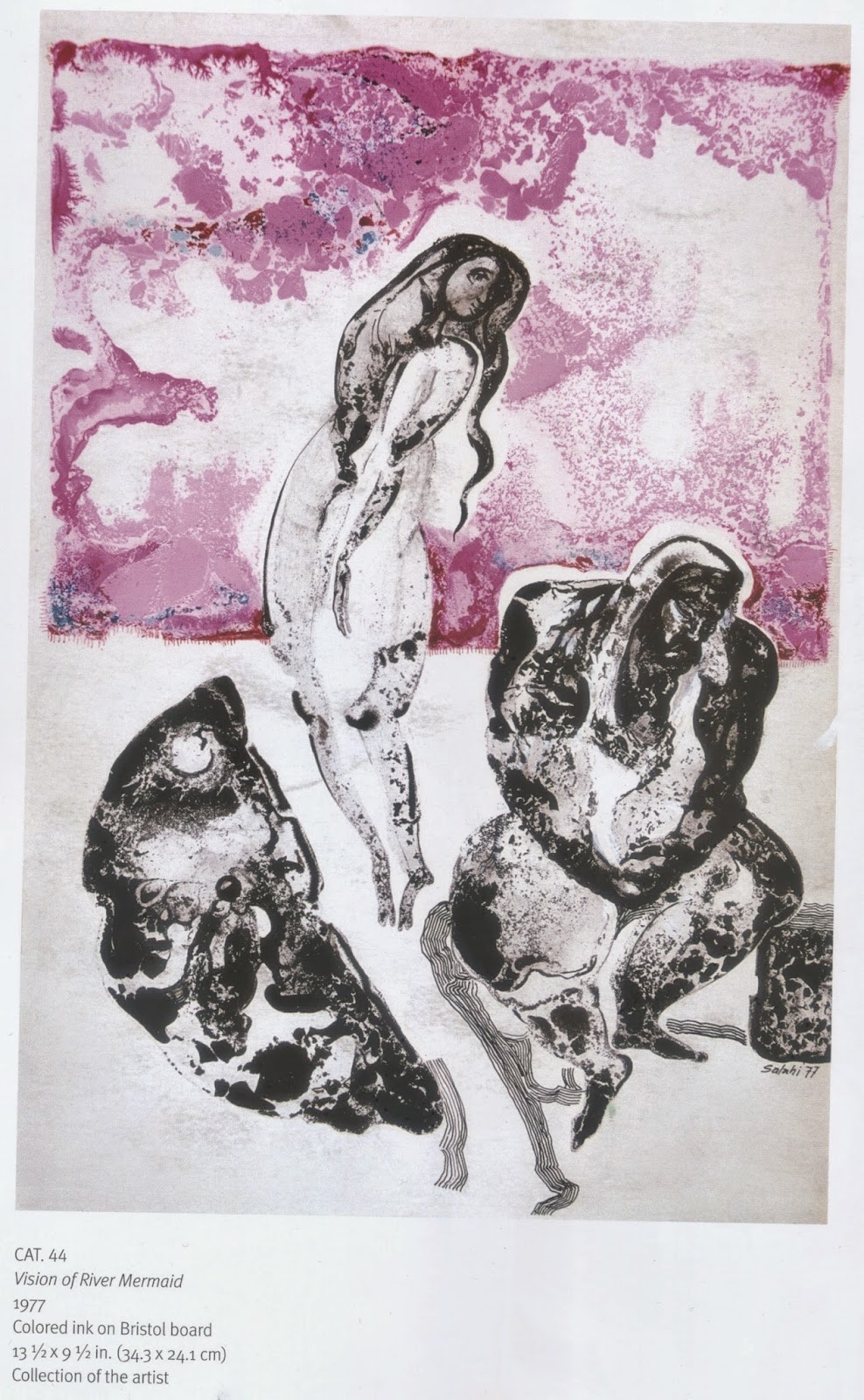
Ibrahim El- Salahi is a Sudanese artist who I first came across last summer at a retrospective of his work at the Tate Modern. He uses inks and watercolour a lot, creating lively and expressive marks in his work, which I think would translate well into textiles. I have been experimenting with different methods of using inks and watercolour, inspired by Salahi. 


Paul Cummins. Whilst in London I went to see the poppy installation, under construction at the Tower of London, I found the impact of it quite moving, the deep red colour is just right, it really is like a sea of blood. I think this is a very intelligent project. Each crafted poppy is fragile and unique and in multiple they are visually stunning. 


It was fascinating to watch the team of volunteers "planting" the poppies, I think there is something special about a collective effort and I look forward to seeing the end result. 


Henri Matisee. Another source of inspiration from my trip to London was the Matisee cut-outs at the Tate. I was pleasantly surprised at the complexity and diversity that Matisee achieved with the limited materials of paper and scissors. I was particularly struck by this study for a stained glass window, "The Bees". It made me think more about abstraction, by refining the subject and capturing its essence the image can become more powerful, I think and still instantly recognisable. I have explored cut-out forms and silhouettes in my summer drawing. It was also interesting to see the way Matisse worked in his studio, how he pinned the elements of his drawings to the walls and played with the composition.


Thursday, 8 May 2014

VV Rouleaux- Ribbons and Trims

Towards the beginning of the project Annabel Lewis, founder of V.V Roulaeux came for a "show and tell." Annabel talked really passionately about her business and brought some wonderful examples of what she sells and also her design inspiration. It was really interesting to hear of the many uses for the ribbons and trims that VV Roulaeux sell; from hats and flower arrangements to fireplace decorations and even hip ornaments for horses! A lot of Annabel’s designs come from vintage patterns and passimenterie and it was inspiring to see how she had taken the very traditional and made it more contemporary. 


http://www.vvrouleaux.com/productcart/pc/web_index4.asp

Throughout this project i have been trying to think of what my samples could be. I have been working on narrow, quite detailed and delicate pieces and i quite like them as they are, as ribbons and trims for adorning anything and everything. I was reminded of the fairground/ folk art i had been looking at and the often ornate detailing on everyday items. I like this idea of decoration in surprise places and on utility items. 
(source- pinterest)


I found the pfaff embroidery has quite different effects on different surfaces, (above: satin ribbon and felt.)

(blackpool pleasure beach archive museum)


Pfaff embroidery on wide ribbon, it also adds texture to a surface.

Monday, 5 May 2014

Artist Focus- Rowland Ricketts

After seeing the lovely effects of dying my pleated samples i started looking at other Shibori and indigo dyeing techniques. Rowland Rickets and his partner Chinami grow their own indigo for dyeing, utilising traditional methods to create contemporary works. The subtlety of the marks is what makes it so special i think and the tonal variations that can be achieved.


http://www.rickettsindigo.com

I have begun to experiment with different ways of folding and pleating fabric to dye. The marks made are really interesting and it is something i would like to explore further at a later date. Re-pleating and manipulating the fabric once it's dyed is also effective.


Friday, 25 April 2014

Weaving with Wire

One thing i wanted to explore was incorporating wire into the weaves to give them structure and enable me to manipulate them once they were off the loom. A lot of my research imagery has movement and shape so i felt making my weaves more 3D would express this well.

 (Sketch book page, pen)

(yarn wrap- colour ideas)


(blackpool pleasure beach)


I tried different ways of adding wire to the weft; these two outcomes are the most successful i think. Handling and manipulating the weaves has also helped me to think about what they might become and their context.

Below is a loom-woven basket with wire warp by Jeanette Ahlgren. I am inspired by what Jeanette has done with sculptural weaving here and the way the colour and pattern has remained strong and complentary to the form. My work is on a much smaller scale than this but has similar qualities, i would like to take these into my final outcome(s).

(Artist webpage- http://mobilia-gallery.com/artists/jahlgren/)

I have also been experimenting on a homemade basic loom with a wire warp.


It has quite a rough finish as the copper wire is difficult to handle but creates a more flexible weave. I used strips of plastic bag as the colours fit well with my theme and i like the self-made pattern that the stripes create. I think this technique needs a bit more refinement but would intergrate well into my project, perhaps combined with embroidery. 

Wednesday, 19 February 2014

Mary Katrantzou


I really admire Mary Katrantzou as a designer. Her use of colour is always exciting and her print designs dynamic and absorbing. I think her work is a particularly good example of print in fashion; the print placement works harmoniously with the shape of the garments.

Inspired by Mary Katrantzou, I wanted to create some samples that have a sense of perspective; to give my work depth and reflect my theme of trails and tracks.

(Above: screen print and dip dye, cotton.  Right: digital design, own photography)
       
I feel the digital design is the more successful, the image had a nice quality to begin with and I could achieve a subtle blending of colours using photoshop. I could imagine this print on a garment or as a stand alone piece. 

Thursday, 6 February 2014

Langlands and Bell

"Air Routes" is a series of work by artists Ben Langlands and Niki Bell. I first came across their animation- Air Routes of the World in the Diagrams exhibition in the Holden Gallery. There is also a collection of prints on the same theme.

(screen print- Air routes of Europe)

The works are generated from international flight plans, showing routes between air ports. They have cleverly used data to give an alternative view of the world; visualising daily activity that wouldn't otherwise be seen. The patterns created are interesting, dense clusters in regions where flights are more frequent, the lines then reaching out to farther flung places. I think the simple black on white and white on black makes them really striking, almost like constellations.

The idea of leaving a trail or trace of where we have been is something i'm interested in for my project.

Wednesday, 20 November 2013

Designer Study : Dashing Tweeds


The use of colour and materials are really inspiring. I love this quirky, contemporary take on tweed.

I also came across Dashing Tweeds whilst researching for material cultures as they are part of the re-birth of Harris tweed and British manufacturing, the cloth being designed and woven in Britain.

http://www.dashingtweeds.co.uk